Nail studio · concept
Miel
Caramel-blush palette, precise femininity
Miel
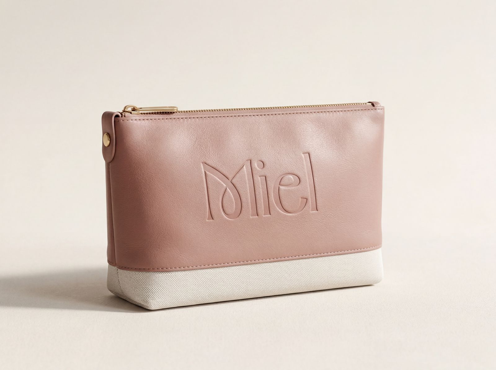
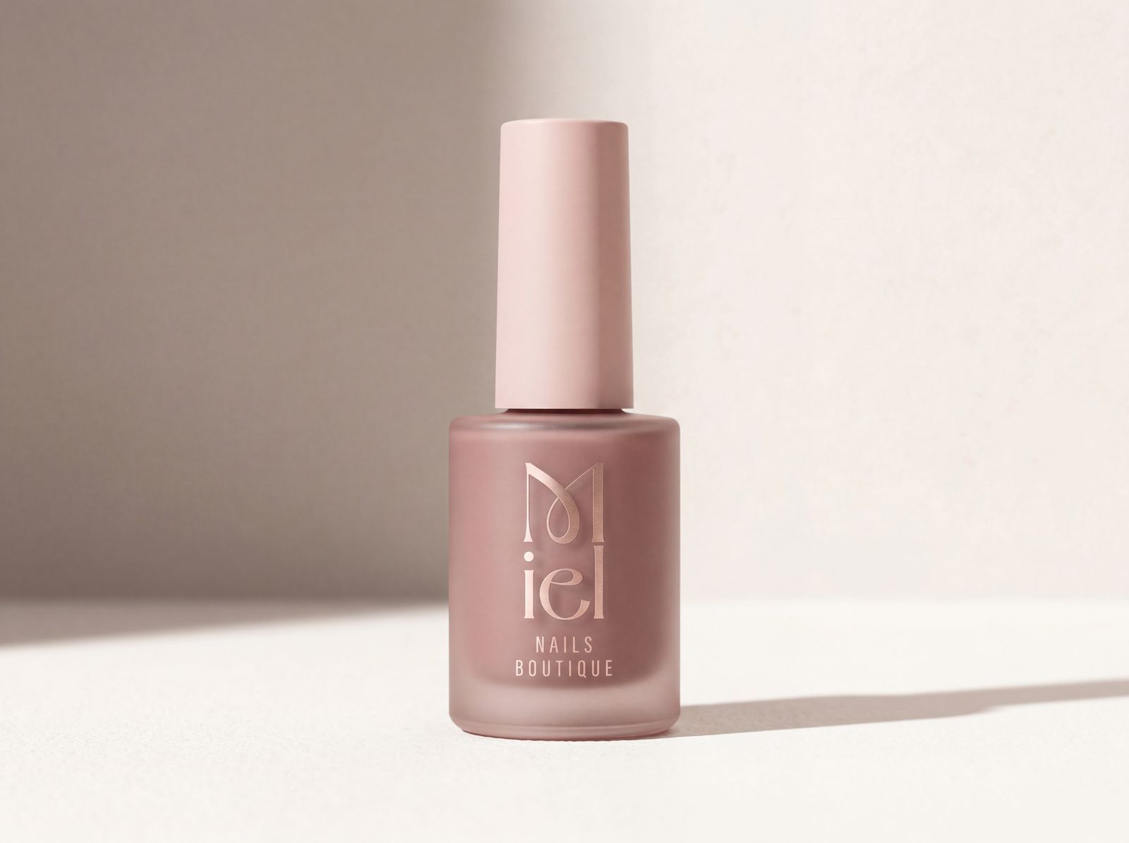
A concept project for a boutique nail studio. The name Miel (honey in French) gave me the tone: warm, sweet, feminine, but also very mature. I wanted something that feels like a small Parisian café, not a typical beauty salon.
"Every Detail Counts."


The story of the logo
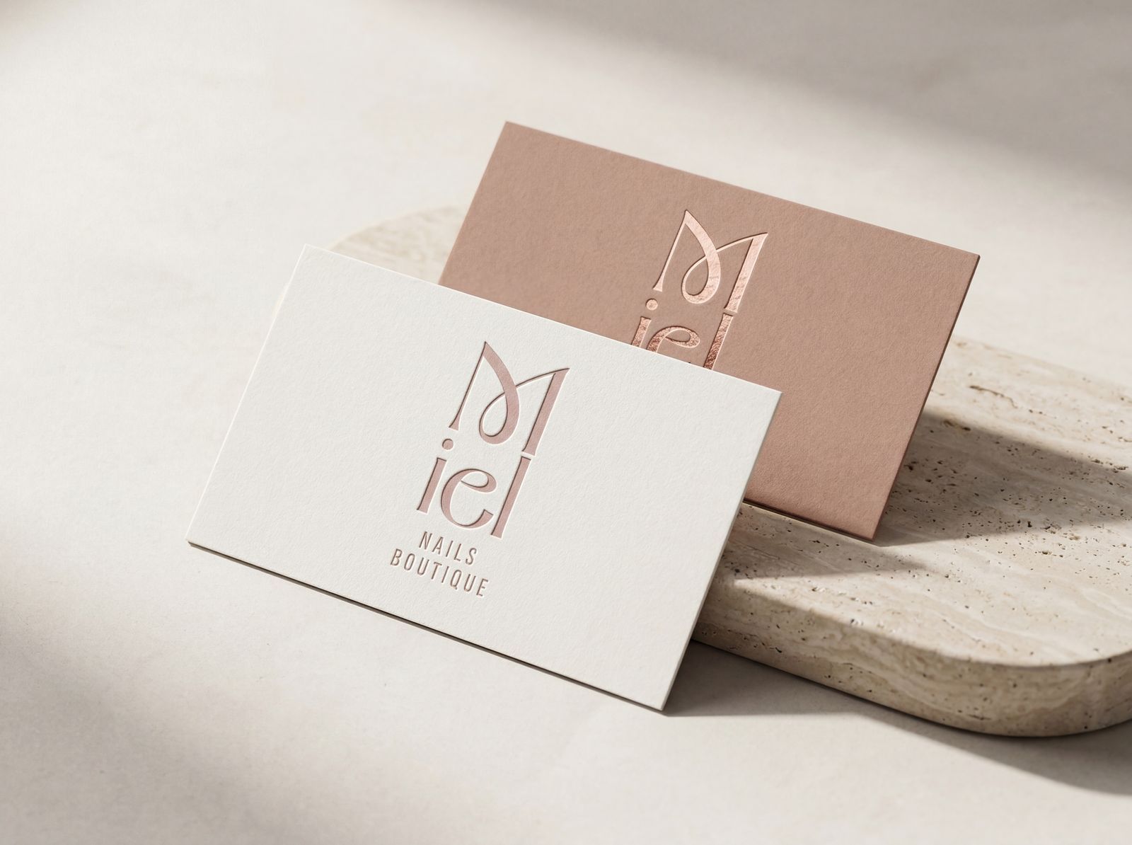
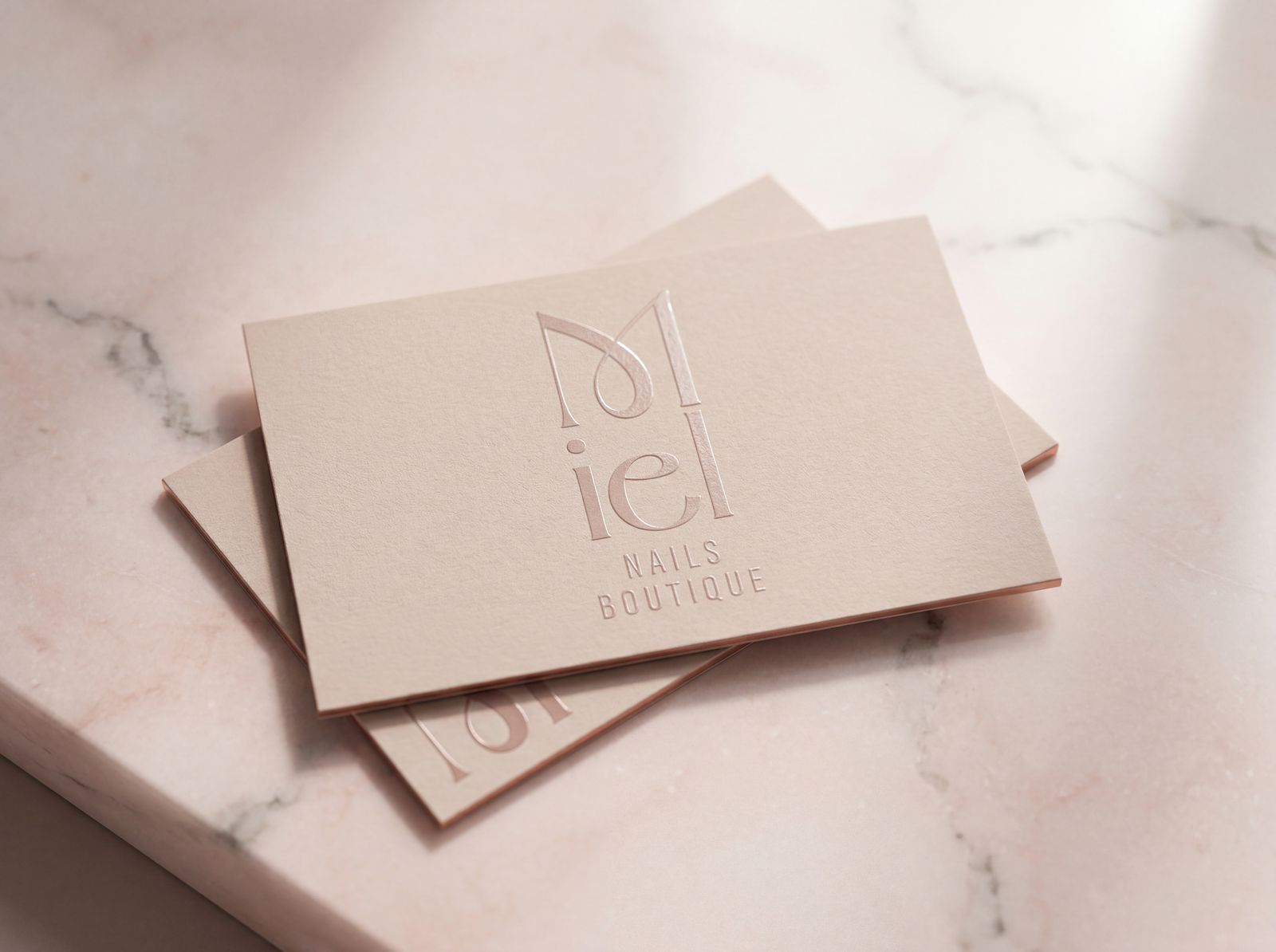
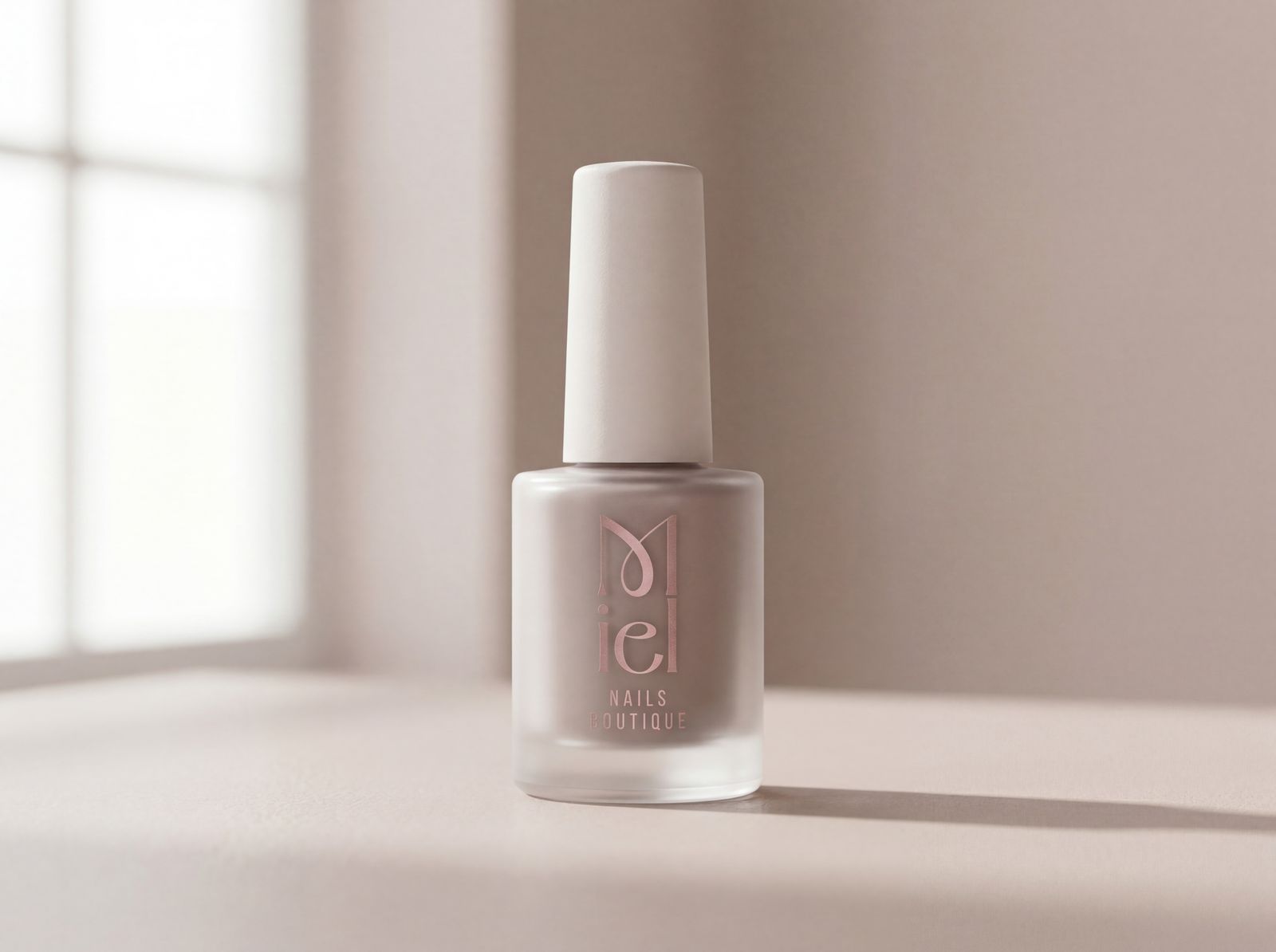
The letter M received a special typographic treatment, creating an elegant, feminine presence connected directly to the brand owner. Combined with "iel" — a system that feels both minimalist and warm.
The palette
Direct inspiration from a hot latte: dusty rose at the top, blush cream and soft blush for the field, warm caramel that softens the pink, and dark chocolate as an anchor. I deliberately avoided "beauty salon" pink — the brown shading keeps the entire palette in adult territory.
Nail and skin close-ups, blush-neutral palette, soft light and precise feminine energy.

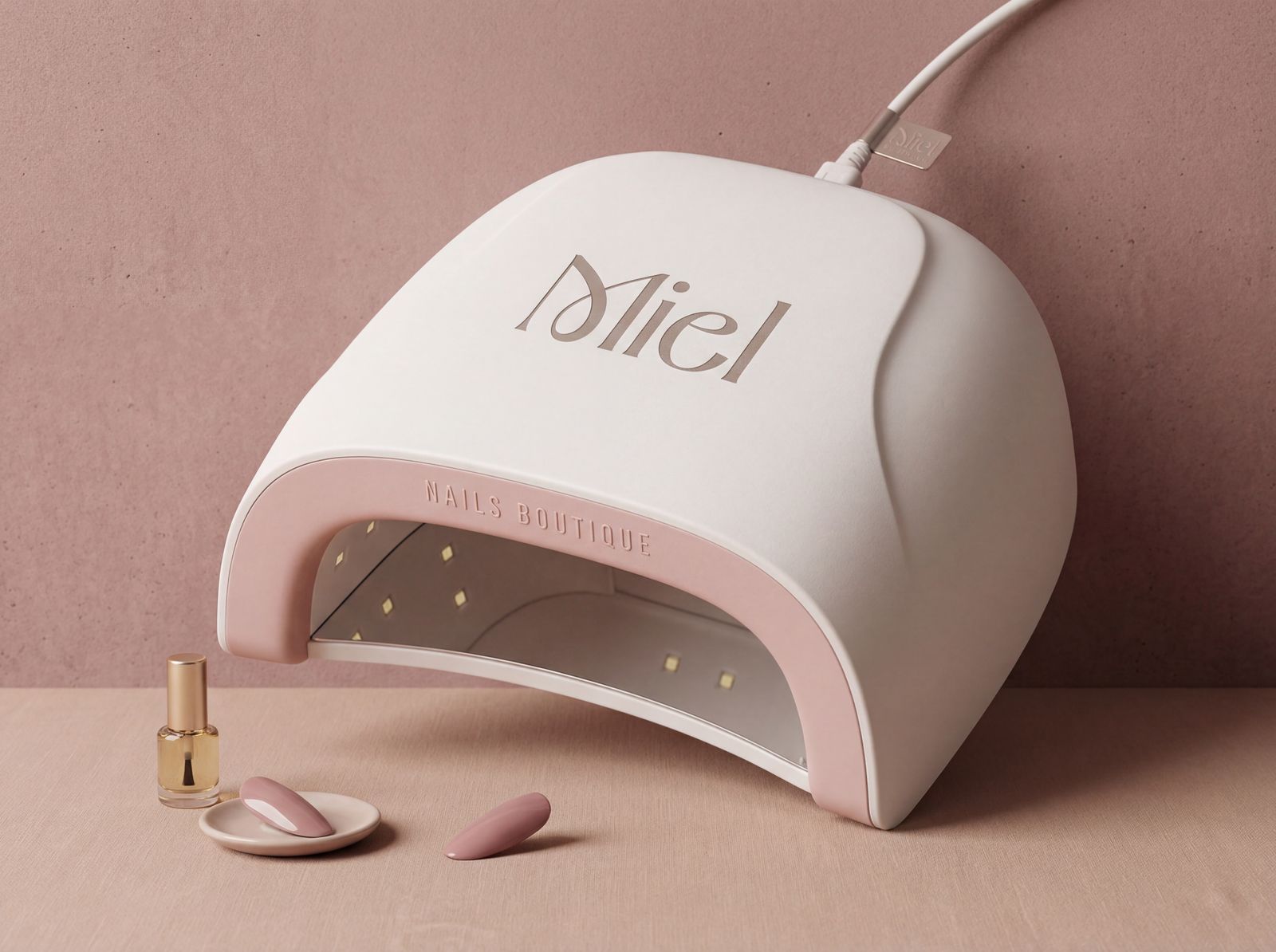
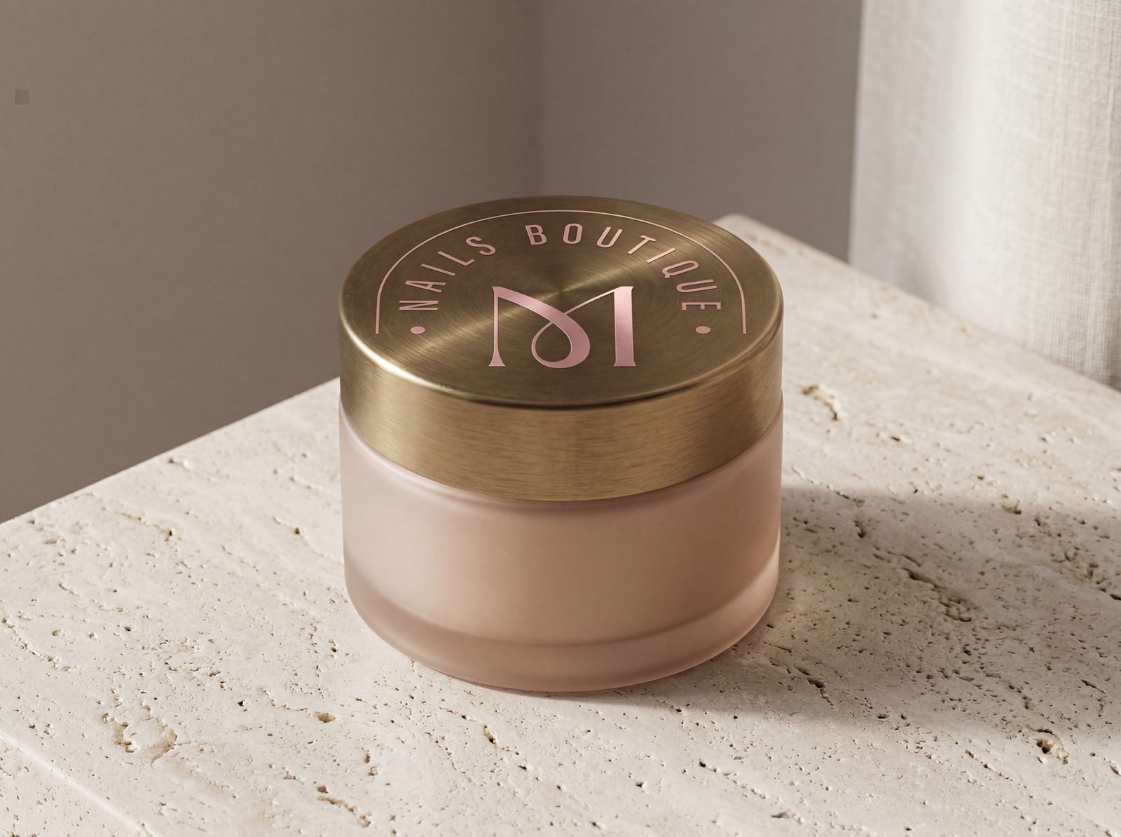
The brand in the real world


Brand book
Logo, palette, typography and applications. All in one document that lets someone else work with the brand without losing the direction.
View brand bookAn identity that feels unique, personal and professional — like the work that comes out of it.