Skincare brand · concept
VEMAR
Clinical green, scientific precision
VEMAR
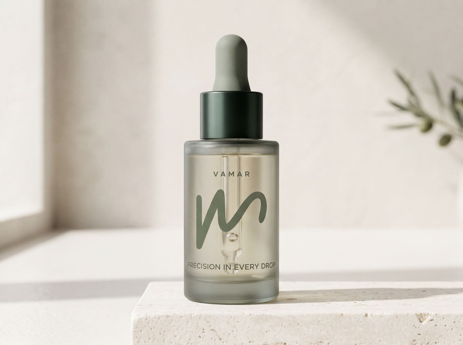
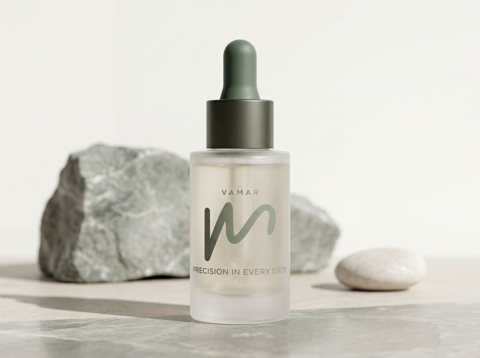
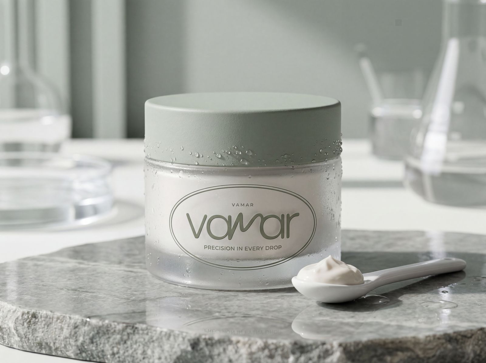
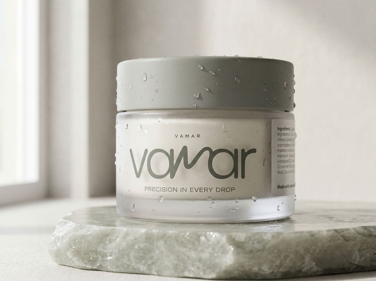
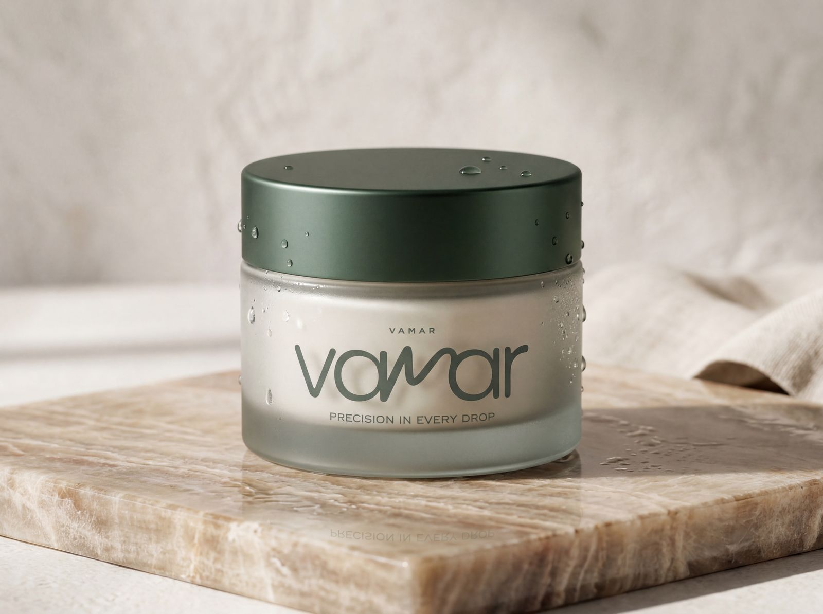
A concept project for a skincare brand with a scientific character. I wanted something that feels professional and minimalist, less occupied with femininity and more with effectiveness. Like a skincare brand you would find in a doctor's clinic.

"Precision in Every Drop."


The story of the logo
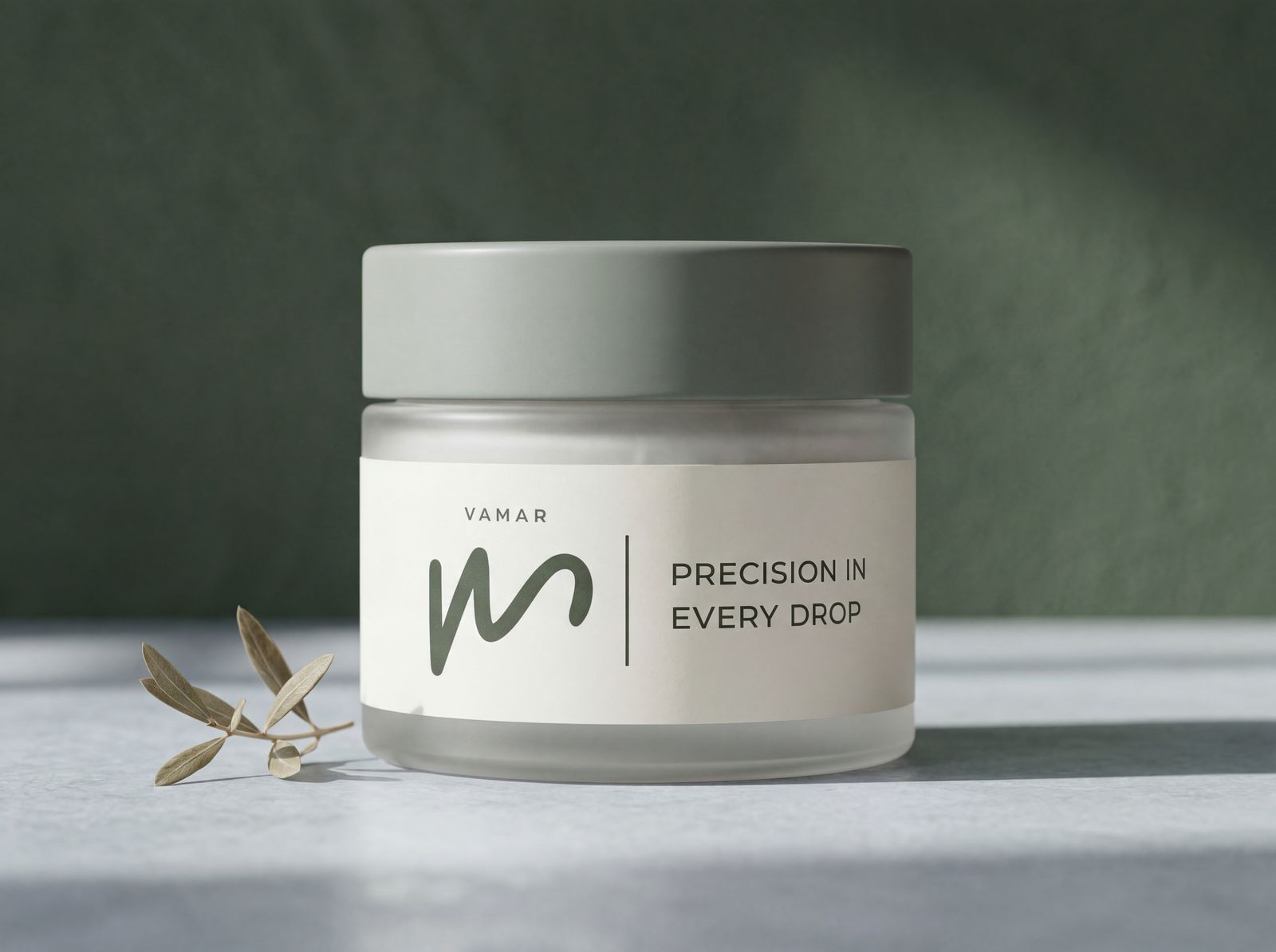
The logo combines a full logotype and a minimalist graphic symbol derived from the brand's visual language. Sage green and white — cleanliness, delicacy, professionalism.
The palette
Sage in four steps, from a soft greyed-green to a deep forest, plus an off-white that reads like prescription paper. I deliberately skipped any warm tone — Vemar treats skin as a matter of science, not indulgence. The green carries the entire weight here.
Natural textures, soft light, balanced compositions. Clean timeless premium look.

The brand in the real world


Brand book
Logo, palette, typography and applications. All in one document that lets someone else work with the brand without losing the direction.
View brand bookA brand that knows what it is — and how to look exactly as premium as it is.