ProjectsPackagesTalk to us
WhatsApp Call

Accessibility

Accessibility tools to make browsing easier.

ZOHAR
CONCEPT PROJECT

Haircare brand · concept

ZOHAR

Chocolate and gold, quiet luxury

About the brand

ZOHAR

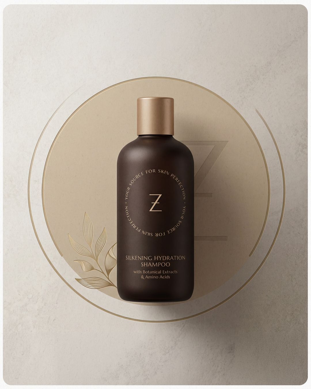
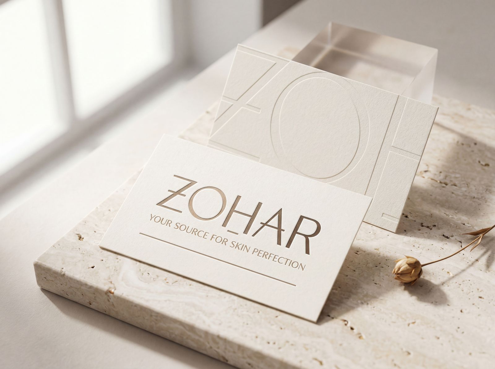
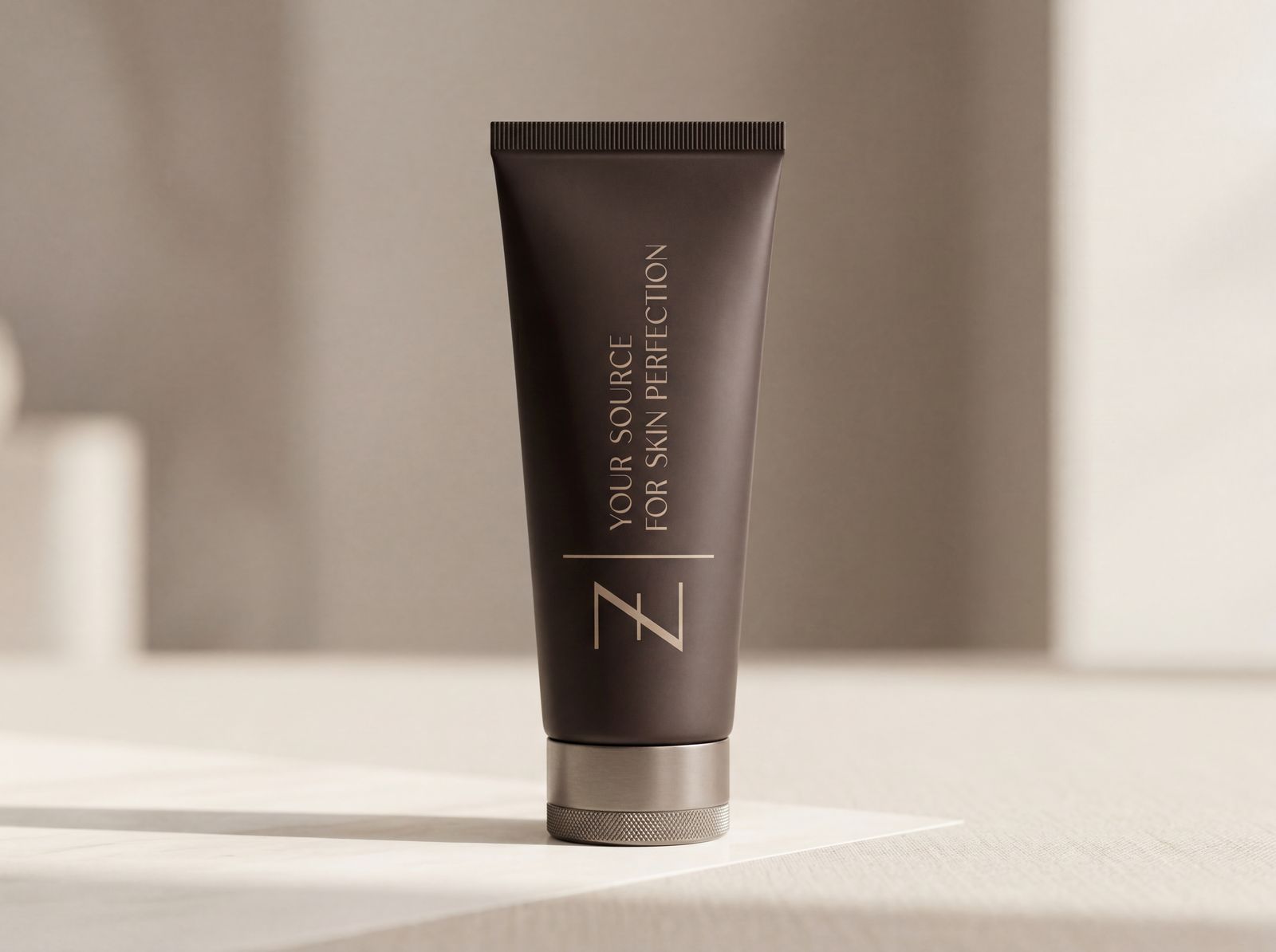
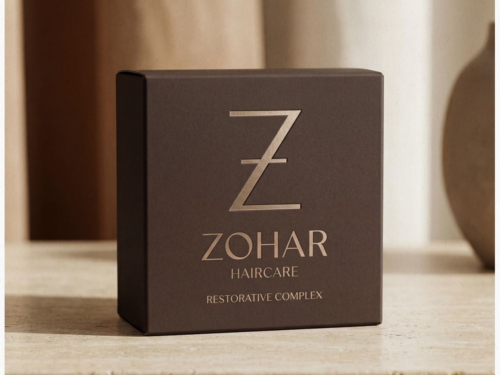
A concept project for a premium haircare brand. ZOHAR in Hebrew means radiance, light. I built around that word a world of chocolate and gold, of warmth and value. A brand that feels different on the shelf of any salon.
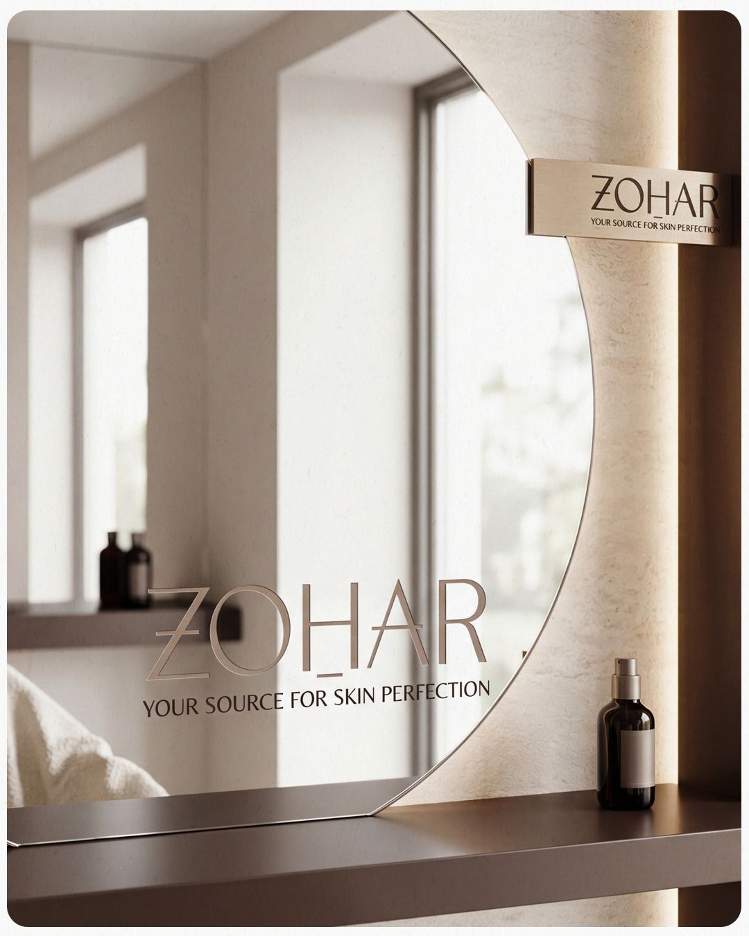
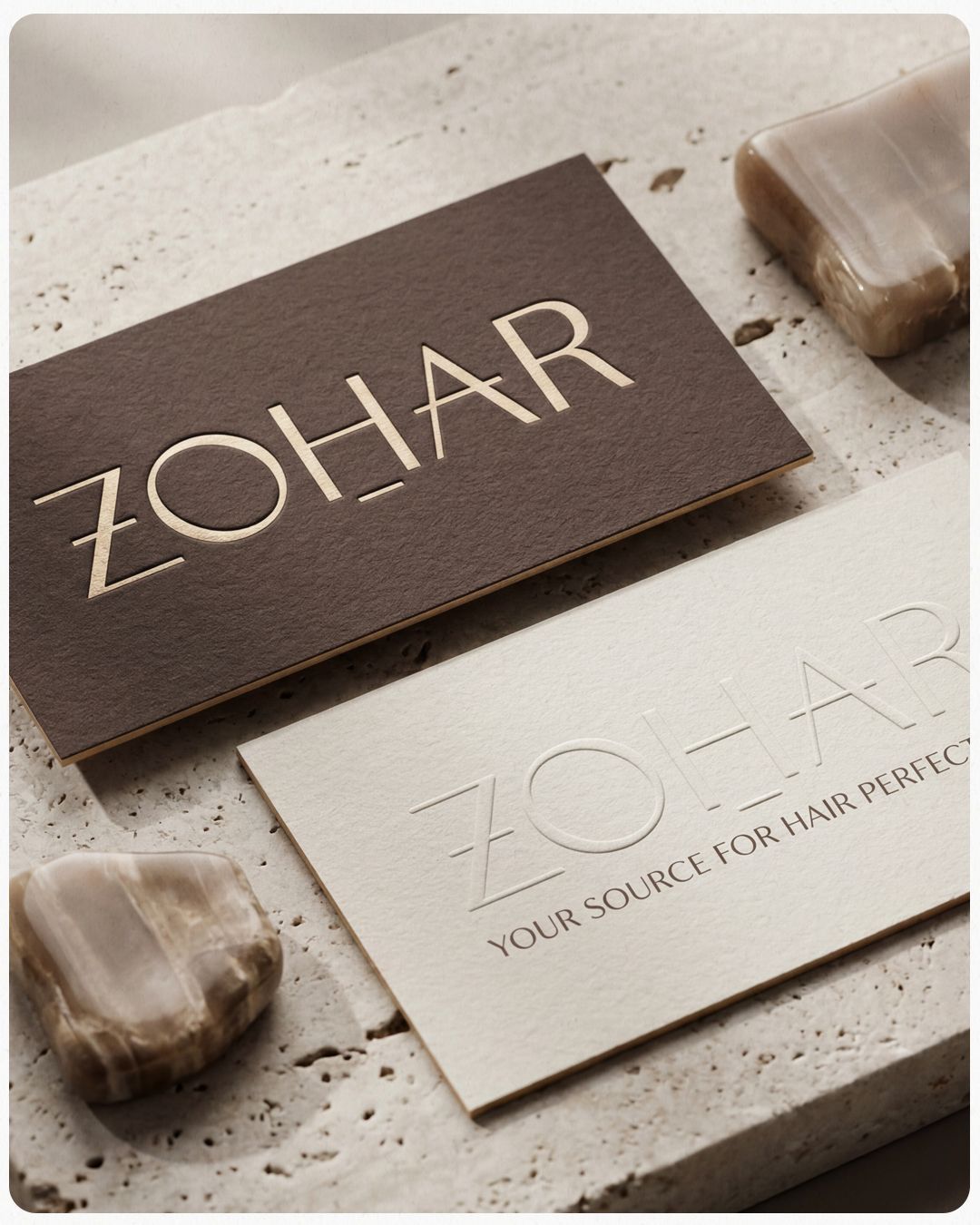
"Your Source for Hair Perfection."
ZOHAR
Colour palette

The palette

Deep chocolate and warm brown for the cartons and labels, a warm cream that mimics the paper of an old book, and two golds — caramel and sand — that complement instead of compete. The gold doesn't shine; it reflects. The whole palette is built to hold its own on a shelf next to haircare brands that have been earning shelf space for thirty years.

#3A2A26Deep Chocolate
#7C6258Warm Brown
#F2E9E1Warm Cream
#C6A27ACaramel Gold
#D3B88CSand Gold
Photography style

Beautiful precise hair in a clean quiet setting. Warm neutral palette, soft light, timeless elegance.

ZOHAR
Brand book

Brand book

Logo, palette, typography and applications. All in one document that lets someone else work with the brand without losing the direction.

View brand book

A brand whose quiet visual language says everything. The level is self-evident.